Plotting in azmpdata
E. Chisholm
12/4/2020
Source:vignettes/plotting_azmpdata.Rmd
plotting_azmpdata.Rmd## casaultb/azmpdata status:## (Package ver: 0.2019.0.9100) Up to date## (Data ver:2021-01-14 ) Up to date## azmpdata:: Indexing all available monthly azmpdata...##
## Attaching package: 'dplyr'## The following objects are masked from 'package:stats':
##
## filter, lag## The following objects are masked from 'package:base':
##
## intersect, setdiff, setequal, unionIntroduction
The purpose of this vignette is to demonstrate how to plot data which
is pulled from the azmpdata package. We show brief examples
of various plotting methods including base plot, and ggplot2. We also
review how to recreate default plots from the gslea package
which has similar functionality to azmpdata but contains
Gulf and Quebec region data products.
The Data
We will use sample data from the azmpdata package for
each example. Data can be called using
## # A tibble: 6 × 22
##   station  year integrated_chlorophyll_0_100 integrated_nitrate_0_50
##   <chr>   <dbl>                        <dbl>                   <dbl>
## 1 HL2      1999                         1.77                    84.3
## 2 HL2      2000                         1.65                   159.
## 3 HL2      2001                        NA                       87.6
## 4 HL2      2002                         1.55                   103.
## 5 HL2      2003                        NA                      148.
## 6 HL2      2004                        NA                      123.
## # ℹ 18 more variables: integrated_nitrate_50_150 <dbl>,
## #   integrated_phosphate_0_50 <dbl>, integrated_phosphate_50_150 <dbl>,
## #   integrated_silicate_0_50 <dbl>, integrated_silicate_50_150 <dbl>,
## #   integrated_salinity_0_50 <dbl>, integrated_temperature_0_50 <dbl>,
## #   salinity_90 <dbl>, sigmaTheta_90 <dbl>, stratification_0_50 <dbl>,
## #   temperature_90 <dbl>, salinity_150 <dbl>, sigmaTheta_150 <dbl>,
## #   temperature_150 <dbl>, sea_surface_temperature_from_moorings <dbl>, …
Base plot
Using base R to create plots can often be the simplest way for a novice to explore a dataset.
If we wanted to create a simple plot of a variable over time, it might look like this
plot(df$year, df$temperature_in_air, xlab = 'Year', ylab = 'temperature_in_air')
Obviously there are many more advanced plots that can be made using base plot but we leave these up to the individual users to explore.
ggplot2
Using ggplot2 can give great simple exploratory plots, using a different ‘grammar’.
If a user wanted to compare different variables over time, ggplot2 has functions which make this very simple.
p <- ggplot(data = df) +
  geom_line(aes(x = year, y = temperature_in_air, colour = 'air_temperature'), show.legend = TRUE) +
  geom_point(aes(x = year, y = sea_surface_temperature_from_moorings, colour = 'sea_surface_temperature_from_moorings'), show.legend = TRUE)+
  labs(y = 'degrees C' ) +
  scale_color_manual(name = "variables",
                     breaks = c('air_temperature', 'sea_surface_temperature_from_moorings'),
                     values = c('air_temperature' = 'red', 'sea_surface_temperature_from_moorings' = 'blue'))


print(p)
## Warning: Removed 6 rows containing missing values or values outside the scale range
## (`geom_line()`).## Warning: Removed 210 rows containing missing values or values outside the scale range
## (`geom_point()`).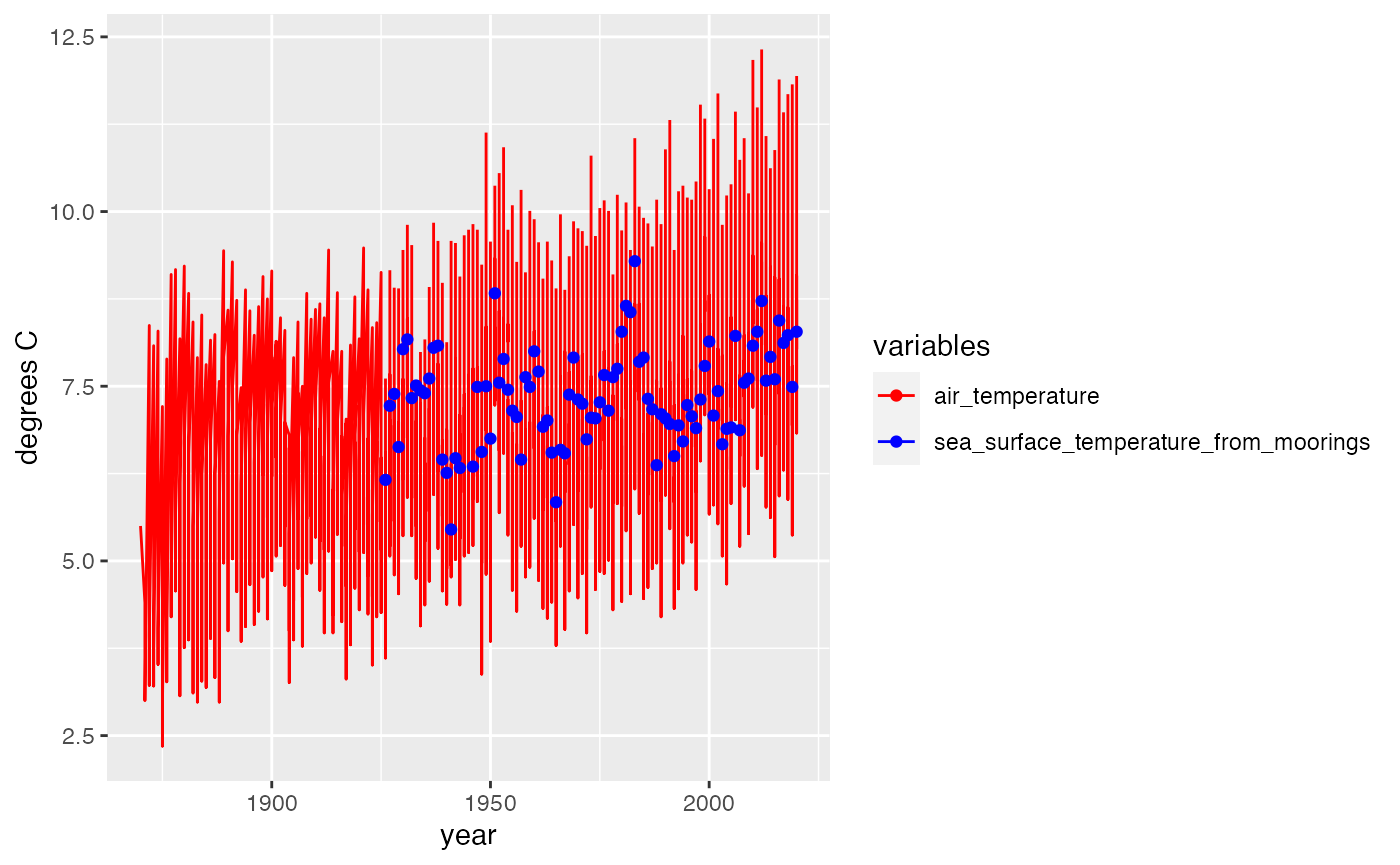
The next two examples contain generic code that could be modified to plot any dataframe (of the same time scale).
Another common plotting task would be to plot the annual means of a given dataframe. This method is fairly generic and could be used for any annual dataset.
df_data <- get('Derived_Annual_Broadscale') # get data
variable <- 'temperature_at_sea_floor' # select variable to plot

# check for metadata and seperate
metanames <- c('year','area', 'section', 'station' )
meta_df <- names(df_data)[names(df_data) %in% metanames]

group <- meta_df[meta_df != 'year']

df_data <- df_data %>%
  dplyr::select(., all_of(meta_df), all_of(variable) ) %>%
  dplyr::rename(., 'value' = all_of(variable) ) %>%
  dplyr::rename(., 'group' = all_of(group))

# set x-axis
x_limits <- c(min(df_data$year)-1, max(df_data$year)+1)
x_breaks <- seq(x_limits[1], x_limits[2], by=1)
x_labels <- x_breaks

# set y-axis
y_limits <- c(min(df_data$value, na.rm=T) - 0.1*mean(df_data$value, na.rm=T),
              max(df_data$value, na.rm=T) + 0.1*mean(df_data$value, na.rm=T))

# plot data
p <-  ggplot2::ggplot() +
  # plot data - line
  ggplot2::geom_line(data=df_data,
                     mapping=ggplot2::aes(x=year, y=value, col = group),
                     size=.5) +
  # plot data - dots
  ggplot2::geom_point(data=df_data,
                      mapping=ggplot2::aes(x=year, y=value, col = group),
                      size=1) +
  # set coordinates system and axes
  ggplot2::coord_cartesian() +
  ggplot2::scale_x_continuous(name="Year", limits=x_limits, breaks=x_breaks, labels=x_labels, expand=c(0,0)) +
  ggplot2::scale_y_continuous(name="", limits=y_limits, expand=c(0,0))
## Warning: Using `size` aesthetic for lines was deprecated in ggplot2 3.4.0.
## ℹ Please use `linewidth` instead.
## This warning is displayed once per session.
## Call `lifecycle::last_lifecycle_warnings()` to see where this warning was
## generated.
# customize theme
p <- p +
  ggplot2::theme_bw() +
  ggplot2::ggtitle(paste(group, variable, sep=" : " )) +
  ggplot2::theme(
    text=ggplot2::element_text(size=8),
    axis.text.x=ggplot2::element_text(colour="black", angle=90, hjust=0.5, vjust=0.5),
    plot.title=ggplot2::element_text(colour="black", hjust=0, vjust=0, size=8),
    panel.grid.major=ggplot2::element_blank(),
    panel.border=ggplot2::element_rect(size=0.25, colour="black"),
    plot.margin=grid::unit(c(0.1,0.1,0.1,0.1), "cm"))
## Warning: The `size` argument of `element_rect()` is deprecated as of ggplot2 3.4.0.
## ℹ Please use the `linewidth` argument instead.
## This warning is displayed once per session.
## Call `lifecycle::last_lifecycle_warnings()` to see where this warning was
## generated.
print(p)## Warning: Removed 255 rows containing missing values or values outside the scale range
## (`geom_line()`).## Warning: Removed 510 rows containing missing values or values outside the scale range
## (`geom_point()`).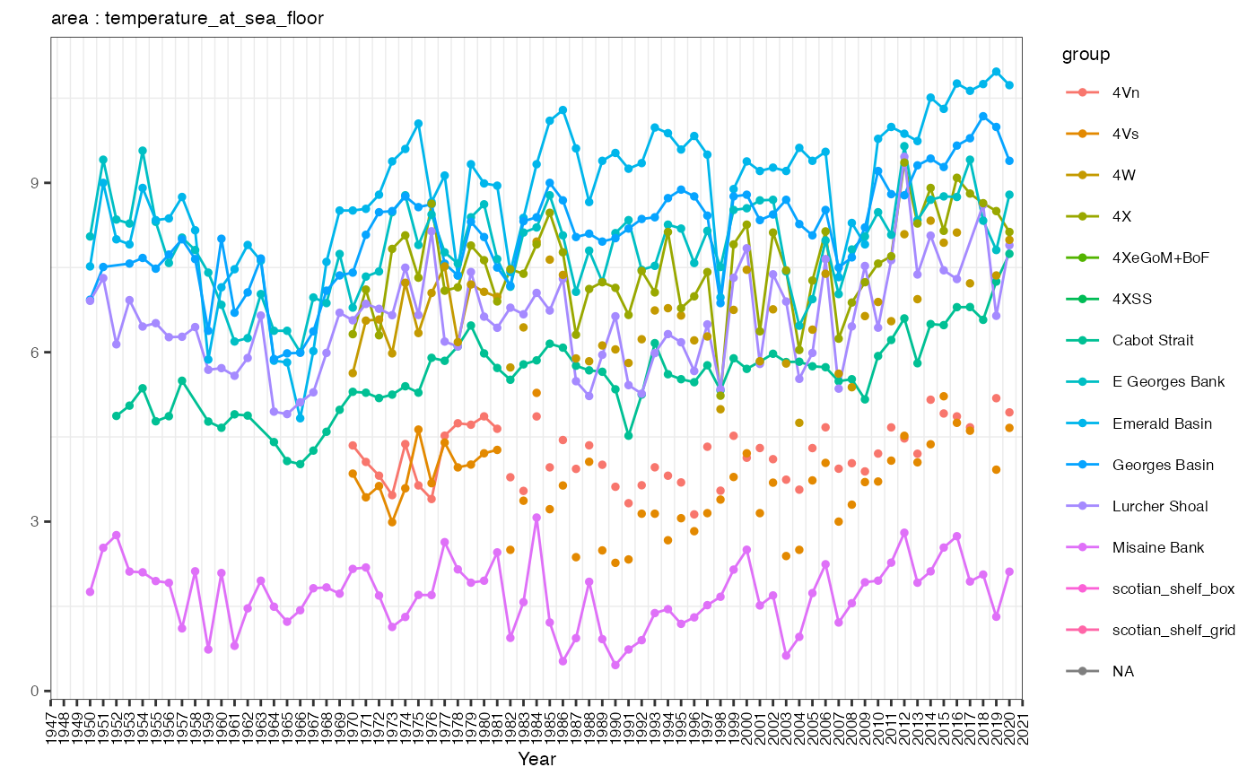
A user may also want to plot a timeseries. This method is also fairly generic and could be modified to plot any Occupations dataset.
  df_data <- get('Discrete_Occupations_Stations') # get data
  variable <- 'chlorophyll' # choose variable to plot


  # check for metadata
  metanames <- c('year', 'month', 'day', 'area', 'section', 'station', 'date' )
  meta_df <- names(df_data)[names(df_data) %in% metanames]

  group <- meta_df[!meta_df %in% c('year', 'month', 'day', 'date')]

  df_data <- df_data %>%
    dplyr::select(., any_of(meta_df), all_of(variable) ) %>%
    dplyr::rename(., 'value' = all_of(variable) ) %>%
    dplyr::rename(., 'group' = all_of(group)) #TODO some dataframes do not have groups!?


  # prepare data
  df_data <- df_data %>%
    tidyr::unite(date, year, month, day, sep="-", remove=F) %>%
    dplyr::mutate(year = format(df_data$date, '%Y')) %>%
    dplyr::mutate(year_dec=lubridate::decimal_date(lubridate::ymd(date))) %>%
    dplyr::select(year, year_dec, value, group)


# set x-axis
x_limits <- c(min(df_data$year_dec), max(df_data$year_dec)+1)
x_breaks <- seq(x_limits[1]+.5, x_limits[2]-.5, by=1)
x_labels <- x_breaks-.5

# set y-axis
y_limits <- c(min(df_data$value, na.rm=T) - 0.1*mean(df_data$value, na.rm=T),
              max(df_data$value, na.rm=T) + 0.1*mean(df_data$value, na.rm=T))

## set shaded rectangles breaks
df_rectangles <- tibble::tibble(xmin=seq(x_limits[1], x_limits[2], by=2),
                                xmax=seq(x_limits[1], x_limits[2], by=2)+1,
                                ymin=y_limits[1], ymax=y_limits[2])

# plot data

p <-  ggplot2::ggplot() +
  # plot shaded rectangles
  ggplot2::geom_rect(data=df_rectangles,
                     mapping=ggplot2::aes(xmin=xmin, xmax=xmax, ymin=ymin, ymax=ymax),
                     fill="gray90", alpha=0.8) +
  # plot data - line
  ggplot2::geom_line(data=df_data,
                     mapping=ggplot2::aes(x=year_dec, y=value, col = group),
                     size=.5) +
  # plot data - dots
  ggplot2::geom_point(data=df_data,
                      mapping=ggplot2::aes(x=year_dec, y=value, col = group),
                      size=1) +
  # set coordinates system and axes
  ggplot2::coord_cartesian() +
  ggplot2::scale_x_continuous(name="Year", limits=x_limits, breaks=x_breaks, labels=x_labels, expand=c(0,0)) +
  ggplot2::scale_y_continuous(name="", limits=y_limits, expand=c(0,0))

# customize theme
p <- p +
  ggplot2::theme_bw() +
  ggplot2::ggtitle(paste(group, variable,  sep=" : " )) +
  ggplot2::theme(
    text=ggplot2::element_text(size=8),
    axis.text.x=ggplot2::element_text(colour="black", angle=90, hjust=0.5, vjust=0.5),
    plot.title=ggplot2::element_text(colour="black", hjust=0, vjust=0, size=8),
    panel.grid.major=ggplot2::element_blank(),
    panel.border=ggplot2::element_rect(size=0.25, colour="black"),
    plot.margin=grid::unit(c(0.1,0.1,0.1,0.1), "cm"))

print(p)
## Warning: Removed 394 rows containing missing values or values outside the scale range
## (`geom_line()`).## Warning: Removed 21697 rows containing missing values or values outside the scale range
## (`geom_point()`).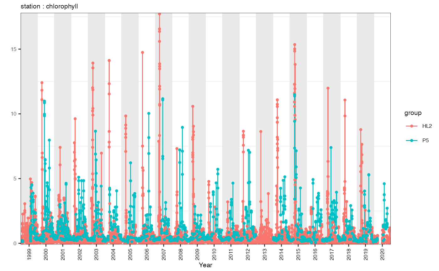
gslea
gslea was a package developed to support ecosystem
approach research in the Gulf Region. It contains a plotting function
EA.plot.f() which can be replicated using
azmpdata.
Note these plots may appear very small in the notebook format.
dat <- get('Derived_Annual_Stations')

actual_EARs <- unique(dat$station) # get regions to plot
dat_only <- dat[,!names(dat) %in% c('station', 'year', 'cruiseNumber', 'longitude', 'latitude', 'pressure')] # isolate data variables to plot (not metadata)
no_plots <- length(dat_only)*length(actual_EARs) # calculate number of plots ot be displayed
# set par info based on number of plots (max 25 per page)
if(no_plots > 25) {par(mfcol = c(5, 5), mar = c(1.3,2,3.2,1), omi = c(.1,.1,.1,.1), ask = T)}
if(no_plots <= 25){par(mfcol = c(length(dat_only), length(actual_EARs)), mar = c(1.3,2,3.2,1), omi = c(.1,.1,.1,.1))}

counter <- 1
for(i in actual_EARs){ # loop through regions
  ear_dat <- dat[dat$station == i,]
  for(ii in 1:length(dat_only)){ # loop by variables
    var_dat <- data.frame('value' = ear_dat[[names(dat_only)[[ii]]]], 'station' = ear_dat$station, 'year' = ear_dat$year) # get only one variable for one region
    if(!is.na(diff(range(var_dat$value)))){ # if all values are NA skip over plotting
      # plot
      if(nrow(var_dat) < 1) plot(0,
                                 xlab = "", ylab = "",
                                 xaxt = "n", yaxt = "n",
                                 main = paste("Station",i,names(dat_only)[[ii]]))
      if(nrow(var_dat) > 0) plot(var_dat$year, var_dat$value,
                                 xlab = "", ylab = "",
                                 main = paste("Station",i,names(dat_only)[[ii]]))
    }
  }
  counter <- counter+1
}
# set par info
par(mfcol = c(1,1), omi = c(0,0,0,0), mar = c(5.1, 4.1, 4.1, 2.1), ask = F)